The Story Behind Our Logo & Branding
When I first founded our dojo, I wanted to establish a brand that expressed the true nature of what we offer. We are what I call a “modern traditional” style of Japanese Jiu-jitsu with a Canadian influence. We don’t have current links to Japan, nor do we have a heavy Japanese influence, but we do uphold many of the original ideals.

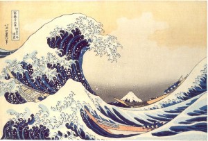
 The logo I created was inspired by Hokusai Katsushika’s painting, ”The Great Wave Off Kanagawa’ created in the 1830s (seen here on the left). It symbolizes how something as soft and flexible as water can generate great power, as with the ideals of Jiu-jitsu. It is also styled to be a yin-yang, symbolizing the ‘give and take’ embodied in eastern martial arts training and philosophy. The orange used in combination with our logo symbolizes the setting sun of the west coast, alluding to the Canadian influence of our style.
In planning the move to our new dojo, I had commissioned a painting to be done by local Vancouver artist Nicole Lissner. I was impressed with her work. I also really like her attitude toward her art. She’ll work with almost any concept (she painted an ocean scene for me having never painted a water scene before), but her only caveat is that she paints for herself, meaning she’ll only paint her vision for the concept, to retain her personal inspiration behind the work. If the client doesn’t like it, they are not required to buy it. She simply keeps the work for herself. I was very happy with the painting she created for the dojo, as you can see below in the photo of me with the artist and the painting.
What you can’t necessarily tell from the photo is that she painted it on 6 planks of wood, reinforced with cross pieces. She spent a good deal of time just selecting the right pieces so that the wood grain would work with her vision.
I spent a lot of time conceiving the brand identity for my dojo, wanting to make sure it reflected the spirit of the dojo I was creating. I am curious though, do people care that much about a dojo’s branding? Do you think it makes much of a difference to you as a student? I suspect it’s one of those things that dojo owners care about more than the students. I welcome your insights in the comments! 🙂


 We're proud to announce that Lori O'Connell Sensei's new book, When the Fight Goes to the Ground: Jiu-jitsu Strategies & Tactics for Self-Defense, published through international martial arts publisher Tuttle Publishing, is now available in major book stores and online. More about it & where to buy it.
Well, yes, I do care about dojo branding (even though I don’t currently have a dojo…I teach out of a community centre but with a goal of getting my own dojo). I think that it’s important from the perspective of attracting the kind of clientele that you want. “Brian’s Tiger Cub Karate” (to use a fictional name) sure isn’t going to work if you want to attract law enforcement, military and special force types. 🙂 Likewise, “Brian’s Elite Killer Commando Warfare School” isn’t going to attract the soccer moms and their tykes. 🙂
I think that you have a great dojo name, logo and identity!
Thanks! Good to know that like-minded people like it. 🙂
I think that the symbol, picture, or logo that represents a dojo is important to consider thoroughly. Simplicity is usually preferrable to me, but a visual representation can communicate in some ways the goals and philosophy of the school, a picture being worth a thousand words and all that. Subtlety is good. Visually dynamic is key. I think you really hit the nail on the head with your logo and dojo name. Many people just go with their own name or their locality (John Smith Jujitsu, North Boondocks Karate Academy, etc). Pacific Wave expresses the fact that the art studied has fluidity and that this is valued much more than the head instructor’s own identity. Makes a student feel like they are a part of something larger than themselves.
Making the student feel like they’re part of something bigger is the reason I went with that type of name. I always felt weird about the idea of using my own name as the dojo name. It feels egotistical, to me anyway.
Very powerful logo Lori. I really like it. I agree with your assessment of the idea of using your own name as the dojo name. If you are a good teacher, people will know it and they will seek you out.
It’s normal to take pride in what you’ve achieved so I understand you’d want to convey what your school means to you to others through symbolism and branding but I doubt most students will see it as more than a name and a pretty picture. It’s what you have to offer and the general atmosphere in the school (the tangibable) that matters most to them, not the philosophical background or symbolism. If I ever have my own school I would create a logo and everything else that goes with that and I’d expect students to wear a school badge on their uniform but maybe I’m just old school. Now in our dojo one guy still wears a gi with the name of his previous karate school on the back, another the badge of our old dojo: personally I think that’s not done but that’s sensei’s prerogative so I can hardly say something about it.
Some time ago my sensei spoke to me about a badge he’d wanted to us to wear (basically a kenpo badge with the main lines and angles like this http://www.familymartialartscenter.com/insights/universal.htm) with the name of our school: personally I think it’s not a bad idea since our curriculum is basically a mix of techniques from different styles and the basis of all martial arts is movement and evasion. The name of our dojo is aptly chosen: Renbukan meaning ‘the place where the martial arts are trained’ so not referring to any particular art nor to a person. What do you think of this?
I personally like having a badge on uniforms. It reminds us that we’re all part of something bigger than ourselves. It also reminds everyone of the symbolism behind the school. I think that kenpo badge would work well. Personally, I prefer simpler designs, ones that are black and white, but everyone has different preferences.
Of course that should have read ‘the tangible’ instead of the nonsense above.